Best Responsive Web Design Techniques for You
A website delivers brand awareness, authority and trust; therefore, having a responsive web design has a great impact on audiences. Poor layout can surely annoy visitors and lots will be complaining about the difficulty of your website. And the worst possible thing to happen is that you will have fewer audiences with a higher bounce rate. That is why knowing the responsive web design techniques can be a huge help in creating an awesome website!
Before you think of having a web designer Sydney, why not try and learn it first on your own? This can be an exciting thing to try! You will never know what these simple hacks may bring and make big differences on your website.
There are many responsive web design techniques that you can find online. But to save you time and effort, we’ve collected the easiest and most important techniques! It can make your site display the ideal font sizes, colours and right angle of images on any devices. Aside from that, there is also a big chance of increasing the number of visitors on your site because of it! Isn’t that cool? You may get some web design support when you are starting to get difficulty handling it. But before you jump on that idea, let us discuss first the:
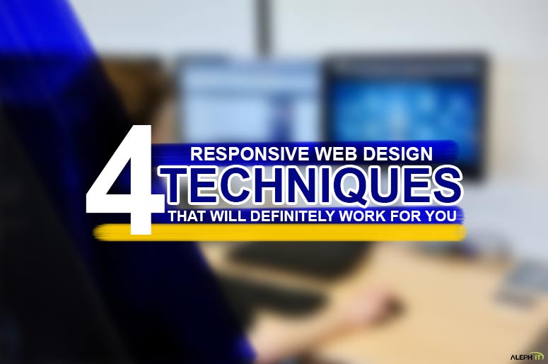
4 Responsive Web Design Techniques That Will Definitely Work for You
1. Create Various Image Size
The first on our responsive web design techniques is to make your site look attractive and present good images on any devices. Consider creating various versions of your graphics. The image size can absolutely affect the page loading speed. Therefore, the bigger the size of the image the slower the page loading is. In which this gives you an opportunity to customise each version of your graphic. You can change the positions of the image, compress and crop to fit the images on the device. Many small devices have high-resolution screens wherein the changes you’re going to make will be unnoticeable even the file size is undoubtedly smaller.
2. Use Exact HTML Tags
Next on our responsive web design techniques; using the exact html tags, you can add the images on the web page. You can use the media queries to change the size of the image of any device. Furthermore, the HTML element can be used as a container such as div tag instead of using the img tag(image). You can also adjust or set image sizes using CSS. Additionally, you can even change the position and dimension properties of the container.
3. Change the Menu Navigation on Mobile Devices
Third on our responsive web design techniques; when viewing pages on large screens, usually, the location of the navigation is either at the top, left or right side of the screen. Larger screens allow you to see the content including the navigation. And when accessing the page, the user won’t find it difficult to view the whole content.
On the other hand, with the hand-held devices, the navigation can cause confusion to the user since the layout is changed in mobile or tab view. As a matter of fact, web elements will be replaced with mobile component to make it look more similar to the desktop view of the website. Some may put noticeable icons to easily recognised by not-so-savvy users.
For instance, on hand-held devices, the navigation menu is commonly displayed as an icon known as the hamburger menu. If we do try making the menu look exactly the same as the desktop view, clickable elements will appear to be too close together which users can find it difficult to tap on to. Therefore, using mobile components for mobile view and web components for desktop view is much ideal for better display.
4. Use CSS media queries for Desktop and Mobile view
Last on our responsive web design techniques but absolutely not the least; keeping the large screen rules outside of any media queries will allow you to keep the backward compatibility with older browsers. Once the media query conditions are met by the users’ screen size, the rules distinguished within the query will override the rules outside of any queries for large screen devices. This will allow you to have some built-in backwards compatibility for browsers that support CSS-based layouts but not CSS3 media queries.
A user-friendly website is considered as a well-designed website; thus, resulting in good feedback and more profits. On top of that, the user’s convenience should be a top priority. Some of the useful ways are the above responsive web design techniques that we’ve got for you. Doing these hacks can bring more audience to your page by visiting it regularly. Of course, it’s not just about the website layout itself, it’s also about the content and how you showcase it. The page that can load smoothly on any types of devices can increase the chance of engaging and keeping the visitors stay longer on it. This can also result for more sales and better ranking in Google as a business owner.
Need a hand on optimising your search engine?
Aleph IT can definitely help you with that! We have a great team of experts in different fields that will work on your website. We can also bring out the best on it by providing the right IT and SEO services you needed. You can check out more information about us and our services offered by visiting our blog section. Give us a call today for further assistance and details on how we can assist you.